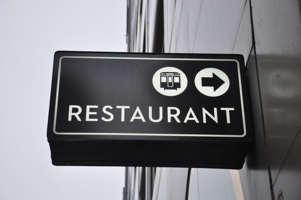
Store signs have become so ubiquitous that people have taken them for granted. Aside from the obvious purpose of a sign, which is to let people know about a store’s business, there are other reasons why signs are necessary. So, if you want to learn more about the impact of your sign on your business, then read on.
Brand Awareness
Aside from pointing out to you that there is a store you might want to check out, signs are also a great way to build your brand identity. This is important because when you’re able to develop your brand identity, it will also help you come up with a well-defined marketing strategy because you know who your target customers are and what image your brand presents itself to them.
Color matters
From the color that you use on your font to the shape of the sign, all of these details are significant when it comes to presenting your brand to the public. If you choose red for your font or background, you’re sending a message to your customers that your products are meant to excite people. That’s because red is often associated with passion, excitement, adventure, and especially romantic love.
If you choose blue for your sign, then you’re sending a message to your customers that your brand is associated with excellence, luxury, exclusivity and also reliability. That’s because the color blue is often associated with those descriptions, especially with reliability.

If you notice, a lot of airlines use the color blue as their primary color in their logos to signify that they are reliable and that they provide great service. Check out British Airways, Lufthansa, and United Airlines; they all have the color blue in their tail wings because they want people to think that they can be trusted to provide excellent service.
So, the next time you buy a laser engraving machine make sure you have an idea of what color type you think would best represent your brand.
Shapes Say a Lot
Even the shape of your sign can have an impact on the way people will view your brand. For example, the most commonly used shapes in signs are square, circle, and triangle. If you choose a square design, then you’re trying to imply to your customers that your brand is reliable. If you choose a circle, it means you want people to associate harmony with your brand. If it’s a triangle, you want people to associate your brand with power.
It doesn’t end there. Other uncommon shapes are often used by those who want their brands to stand out, but still feel familiar. Expert psychologists say that uncommon shapes like hexagons or pentagons imply that the brand they represent is unique. But at the same time since these shapes closely resemble a square, people won’t find the brand too obscure or far from the norm. So, in a nutshell, it’s like trying to catch everyone’s attention by doing something unique but not too weird that you’ll turn people off.
Signs have so much to say about a business and, more importantly, its brand. So, if you want your business and your brand to be popular and successful, you need a well-conceptualized sign to represent it.

